Project Overview
For this project, I designed a website for EcoVibe, a brand focused on selling eco-friendly and sustainable products. The main goal was to create a modern eCommerce site that promotes environmentally conscious living while making it easy for users to browse and purchase products.
The target audience was people aged 18-65, specifically those who are interested in sustainability. The client’s main requirement was for the site to be simple but modern-looking, and they wanted to ensure that the design reflected their eco-friendly values.
Design Process
I spent a lot of time researching other eco-friendly eCommerce sites to understand what works in this space. I then went through the following steps:
User Research: I started by looking at similar websites in the eco-friendly niche to get an idea of how to structure the site and which elements would be most important to users. I focused on creating a design that would be intuitive for the user while highlighting EcoVibe’s sustainable products.
Wireframing & Prototyping: I created low-fidelity wireframes in Figma to outline the key sections of the site, such as the homepage, product pages, and footer. From there, I moved on to high-fidelity prototypes, adding in colors, fonts, images, and content to make the design more realistic.
Challenges: I faced challenges when organizing the design and ensuring all elements were responsive across different devices. I also had to strike a balance between making the site visually appealing while keeping it functional.
Insights: Through this process, I learned how important it is to keep the user experience at the forefront. I tried to simplify the navigation and make the product information as clear as possible to help users find what they’re looking for easily.
2. Design Decisions
Here are some of the key decisions I made during the design process:
Color Palette: I chose a combination of green and earthy tones to reflect the natural, eco-friendly message of the brand. The dark background helps to make the products stand out, while white text provides a clean contrast for readability.
Typography: I kept the fonts simple and modern to maintain a professional look while ensuring that everything is easy to read. This aligns with the client’s goal of having a clean and contemporary design.
Imagery: I used high-quality images of the products and nature-related visuals to strengthen the connection to the brand’s sustainability mission. The images are clear and minimal, allowing the products to be the focal point.
User Experience (UX): I focused on making the navigation simple and easy to follow. The homepage has clear call-to-action buttons (“Shop” and “Learn More”) to guide users toward their next step. The shop page includes filters that make it easier for users to browse through different categories, like home goods, skincare, and fashion.
Responsiveness: I designed both desktop and mobile views to ensure that the site works smoothly on all devices. This was important because a lot of users would likely be browsing from their phones.
3. Key Features
Here are some of the main features I incorporated into the design:
Homepage: The homepage opens with a hero section that features EcoVibe’s products along with a tagline that emphasizes the brand’s commitment to sustainability. Below, I included a section that highlights product categories (like reusable household goods, organic skincare, and sustainable fashion) to make it easy for users to start shopping.
Shop Page: The shop page is organized with filters so users can sort products by category, price, and popularity. Each product has a brief description, price, and a “Buy Now” button to streamline the shopping process.
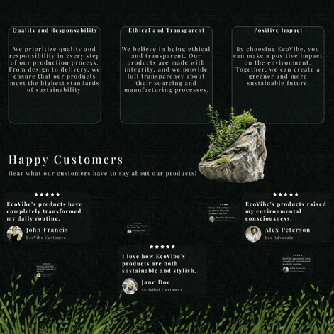
Why Choose Us Section: I added a “Why Choose Us” section to highlight EcoVibe’s core values, like quality, ethical production, and positive environmental impact. This was meant to build trust with the customer by showing them how buying from EcoVibe contributes to sustainability.
Testimonials: I included customer reviews to give social proof and make the site more credible. Testimonials from satisfied customers help to reassure new buyers that they’re making a good choice.
Footer: The footer includes essential quick links like shipping policies, return information, and discounts. There’s also a newsletter signup to encourage visitors to stay connected with EcoVibe.
4. Final Outcome
I’m really proud of how the project turned out. It met the client’s goals of being simple and modern, with a clean design that’s easy to navigate.
Aesthetic Appeal: The color scheme and layout successfully reflect the eco-friendly values of the brand while keeping things visually appealing. The design feels fresh and modern without being overwhelming.
Usability: The user experience is straightforward, and the navigation makes it easy for visitors to find products, read about the brand’s mission, and check out smoothly.
Future Enhancements: If I had more time, I would love to conduct usability testing to see how real users interact with the site and gather feedback on how to improve. I’d also like to add more animations or interactive elements to enhance the user experience even further.
Here you can find a link to the figma prototype.


